EUDAIMONIA VOL #2: YOUR BRAND HAS TO BE YOURS
Alright y’all. For those invested in the coffee roasting journey, we’re moving on to phase two: Branding and marketing. This is literally my favorite part of starting a business. Branding is what makes you different from anybody else in the marketplace. Coffee is a completely saturated market. Everybody and their mom owns or wants to own a coffee shop/sell their own bags of coffee. You got white label roasters, toll roasters, home roasters, large scale production roasters, etc. The problem? Nobody starting out knows how to properly target their audience through their branding and marketing. This is where I think people go with the “what does traditional marketing and branding say about how to approach this?” But that doesn’t work. At least in it's ability to get you through the inevitably difficult times. No matter how perfectly aligned with market research, how tailored to a niche group of people, how frequently your ad campaigns are run, etc. your company is going to start in a place that’s just a person with a dream. For this reason that dream has to be your dream.
It’s actually really hard to explain, but think of it like other peoples’ kids. Kids are expensive, loud, chaotic, can’t communicate well, keep you awake at night, break things, etc. But you love your kid, so all of those things are okay. You put up with them. Other peoples’ kids bring all of the same issues but you don’t love them like you love your kid so you don’t want to put up with all of it. When you first start a business, it throws up, shits, falls over, hurts itself, hurts you financially, makes you question everything, keeps you up at night, etc. But as long as it’s yours, you’ll love it all the same and put up with it. So by trying to match a pattern, approach, plan, etc. you’re essentially going to be starting a business that’s the vision of somebody else and you won’t love it same as if it was yours. Does that make sense? Probably not. But that’s okay. That’s my really long convoluted way of saying that marketing and branding has to resonate with you above all else. It has to be yours. If you love it, if you’re proud of it, if you’re excited about it, if you want it, you’ll go much farther with it.
Back to the story. I was starting with bag design because in coming up with bag design we’re going to learn a lot about the personality of the company. Whether or not we like it, books are indeed judged by their cover. First impressions start with first sight. People know within approximately .0005 seconds whether or not something looks good to them. That’s people, food, clothes, movies, books, etc. Don’t be fooled. So, the packaging is super important because we need to capture attention right away. Now, because of the untraditional name of the company, I wanted to make it something that’s a bit more universal. A “eh, seems cool” is better than “not interested at all.” It allows the door to stay open so you can slowly get to know them and gain their trust. It’s like that one scene in Ocean’s Eleven when Rusty is giving last minute tips to Linus:
“Don't use seven words when four will do. Don't shift your weight, look always at your mark but don't stare, be specific but not memorable, be funny but don't make him laugh. He's got to like you then forget you the moment you've left his side.”
That’s what I want in my brand. Now unlike in the movie where they want to interact then be gone forever, we want to come back around. So the dynamic is the same, but we want to leave more of a lasting impression, and that’s where we let the coffee do the talking. So, per usual, here’s the prompt I gave Chat:
“Hi Chat, you know how we are starting a coffee roasting company together, Eudaimonia? Well I'm sharing our series online so people can be a part of the journey. Last time I prematurely asked you for some designs but I didn't get any visuals. I'm going to send you the brand sheet you put together. Can you mock up some bag designs for me?”
For those who have been following each chat, you can read the whole thing here. Now, I will warn you, it’s a long one because this takes so much time. And, for those that read the whole chat, you’ll see the evolution of the bag design. I’m actually surprised I got here as quickly as I did. In summary, I wanted to say homage to Aristotle and philosophy. But I forgot the words of wisdom from Rusty: “Don't use seven words when four will do.” See I already paid homage to Aristotle and philosophy by using the name EUDAIMONIA. So, you’ll see in the chat I’m having ChatGPT craft all these images of Aristotle before I then ditch the whole Aristotle image altogether. So here’s the first bag:

I started dropping color palettes to get an idea of the colors that I might want. So I started prompting chat to use the other colors in the palette:

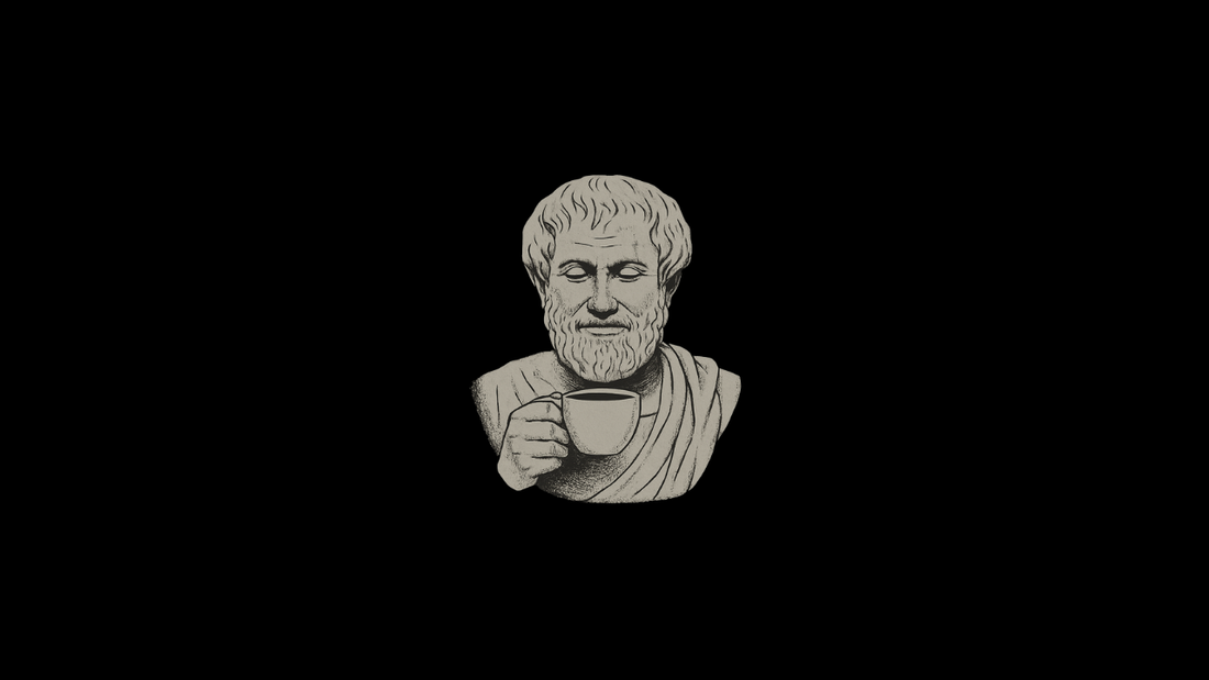
Pretty cool right? Yes, but something didn’t feel right. So I kept going but this time trying to replace the logo with Aristotle and….. boom:

Way too much Philosophy. I mean, as if Eudaimonia was niche enough I now had a giant portrait of Aristotle with a cup of coffee hahahahaha also chat (as it usually does) took a turn and at one point spit this one out:

I can’t tell if that’s my uncle Mike or Aristotle. We got real far from the mark on that one. It was about around this time that I decided to take things into my own hands. So I went into canva and started messing around with fonts and leaned on ChatGPT for help with that. This is the outcome:

Starting to get somewhere. And that place is here:
![]()
This is the exact point that leads to light at the end of the tunnel. I can’t tell you how many times I literally wanted to scrap it all and start over. HOWEVER, through all of this (the pain in my eyes from staring at my computer screen, the shitty images of Aristotle, the confusion on the direction of the brand) I was subconsciously putting together all the pieces that I liked. So when this showed up on paper (Canva) I was like okay cool we’re on to something. So, long story short, we ended up here:


Now, I’m sure which one of these I like better. So, fun little game. If you’ve made it this far, I appreciate your interest and value your opinion. Top image is 1 through to 3—if you feel so inclined, comment on this post which one you like better. All the elements are there for me and that’s the important part. Now I can outsource the rest.
I’m going to break this down quick. Eudaimonia is the reference to philosophy the bedrock of the whole company message: seek fulfillment, not happiness. This can be found in the smallest of places, even a cup of coffee i.e. why I’m starting the company. Second, the phonetic spelling is educational. I think education is super important and provides the tools for people to be able to flourish. The coffee facts. I always like knowing the story of the bean. What variety is it, where was it grown, how was it processed, etc.
And there you go. A logo with a story. Now, this is getting way too long so I’m going to wrap up here. Next up we have packaging. I will let you know once I’ve gotten the roaster in and everything along those lines so don’t worry. We’re moving forward but not forgetting about the updates.
Stay caffeinated.
~ Bonde
5 comments
I’m stuck between #1 and #2! The alignment of the text below the name in #1 gives it a modern feel because it fills the negative space between “Eudaimonia” and the coffee origin box, making it more squared off. But the alignment in #2 is symmetrical and is more formal and balanced. Just depends on the vibe you’re going for! I love the coffee bean in place of the “O”, I would maybe use a thicker/darker and less detailed coffee bean graphic to blend with the font more.
Hmm… 1!
#2. The symmetry is more appealing to me personally. It’s also still got the coffee bean thumbprint as opposed to the third, giving it more character.
2.